UI & Website Design
Asked by the director of a London based website company to re-design this cosmetics website.

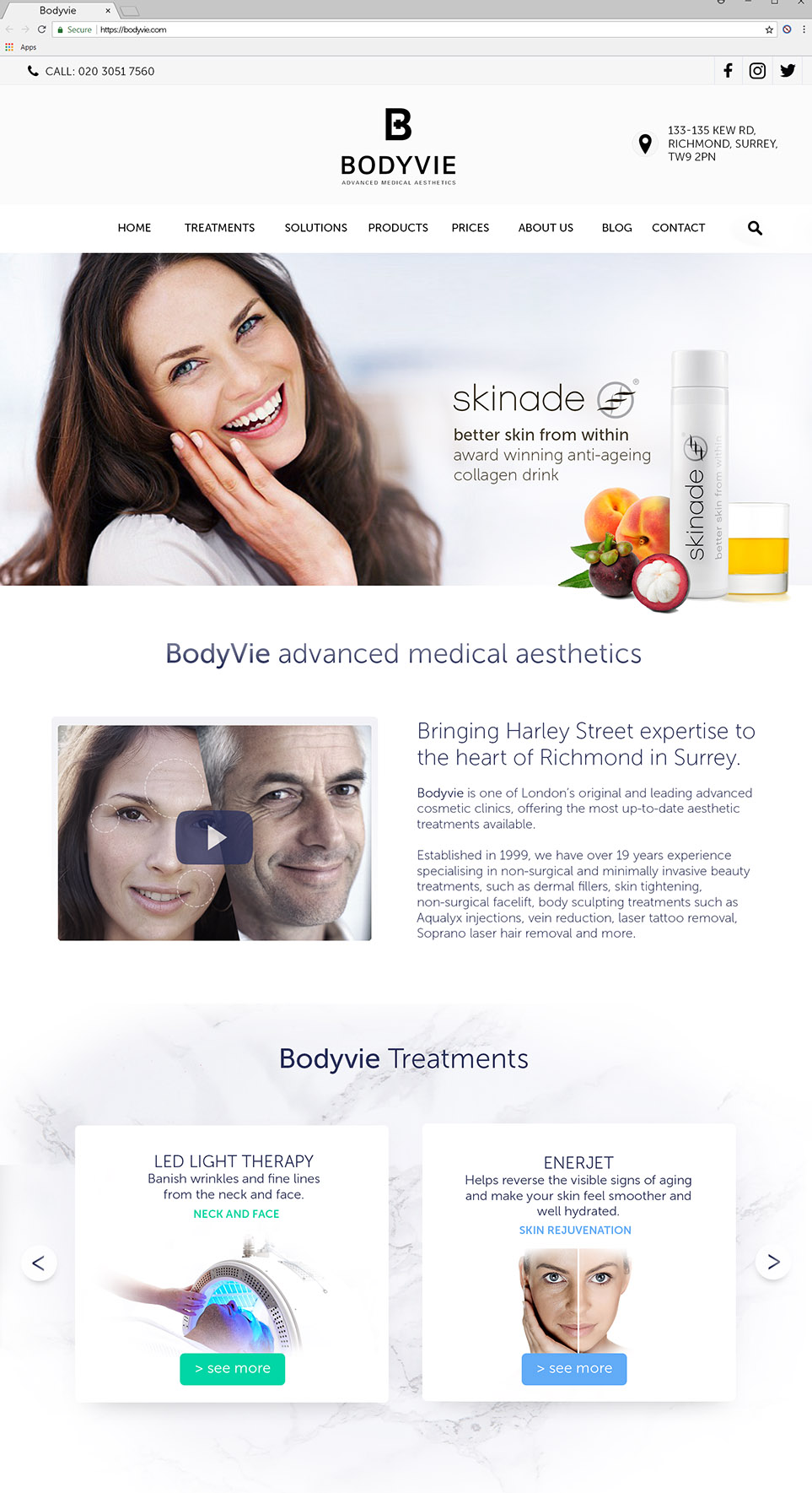
This cosmetics company had a very dated website – I was asked to come up with a design that better represented quality cosmetics. Featuring sections for:
– Header and Navigation
– Banner
– Intro with video
– Treatment types

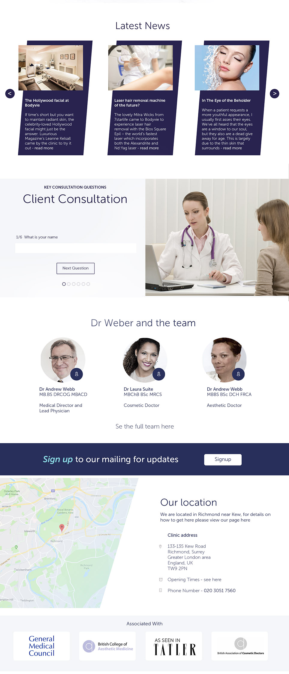
Bottom half of page – featuring sections for:
– News
– Consultations
– Team
– Signup
– Location
– Associated

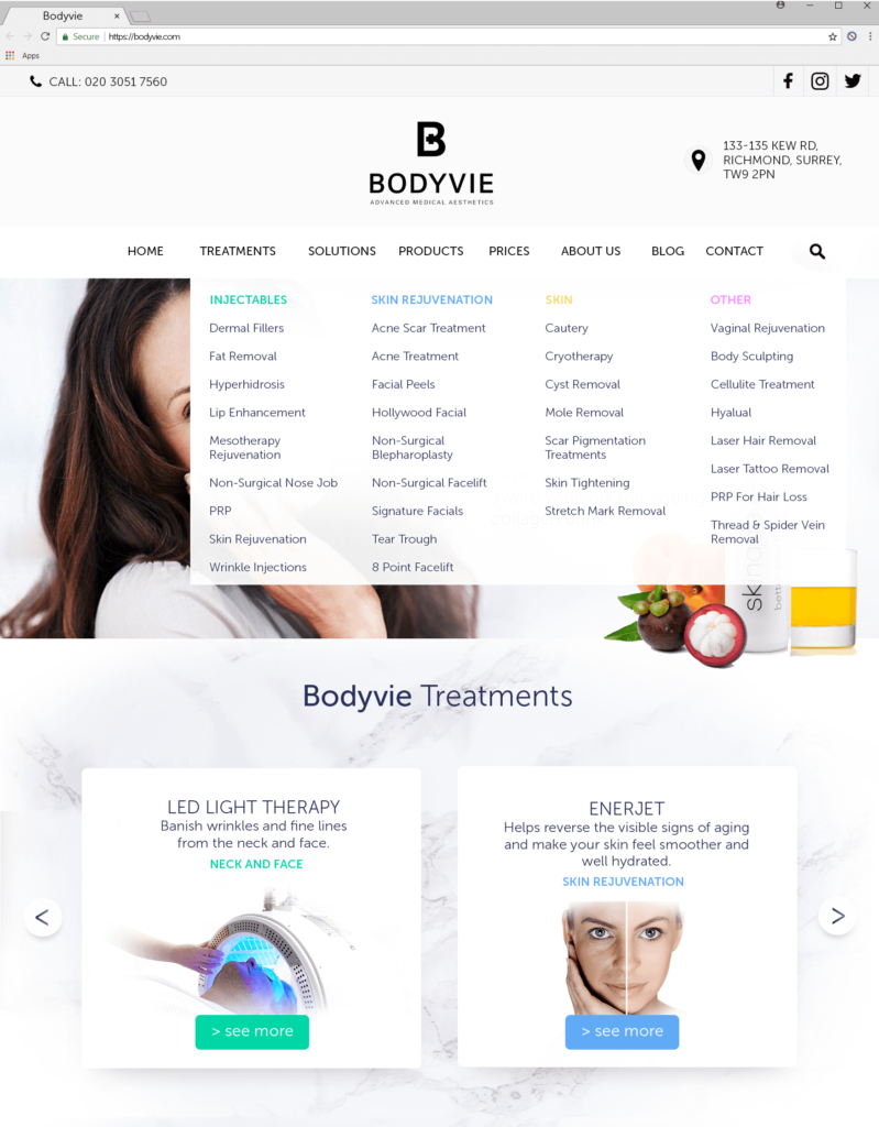
Menu concept design – working towards a colour coded product menu to make navigation through the numerous product types easier, these colours could have been used as accents through each of the product and category pages.


